Slanga
Learn slang like an Aussie
What is Slanga?
Slanga is an app designed for international students to educate themselves on Australian vernacular using unique examples and accurate VoiceOver integration. This was designed as part of the Apple Foundation program at RMIT, a program which focused on developing an app using Apple’s unique design features. Designated the role of UX/UI Designer and App Icon Designer, I collaborated with my team to ensure we created a product with accessibility at the forefront of our development process.
How did we create Slanga?
During the intensive 3-week program at the Apple Foundation Program, we conducted vast interviews, brainstorming sessions and created and iterated Figma prototypes to develop a successful proof of concept. These Figma prototypes were then brought to Xcode, using SwiftUI to create an interactive demonstration of our app, including animations, fast scrolling and most importantly, showcasing our VoiceOver integration.
Who is our audience?
This app was created with international university students as the primary target audience. Our group conducted interviews with students within the Apple Foundation Program as well as sharing our own personal experiences. During our research, we noted that a fear of cultural mistakes and language barriers make socialising with locals difficult, which can lead to an increase in social isolation and reducing feelings of belonging, therefore increasing the likelihood of cultural shock.

Let’s hear how confusing Aussie slang can be
Credit: Monty Franklin on Instagram

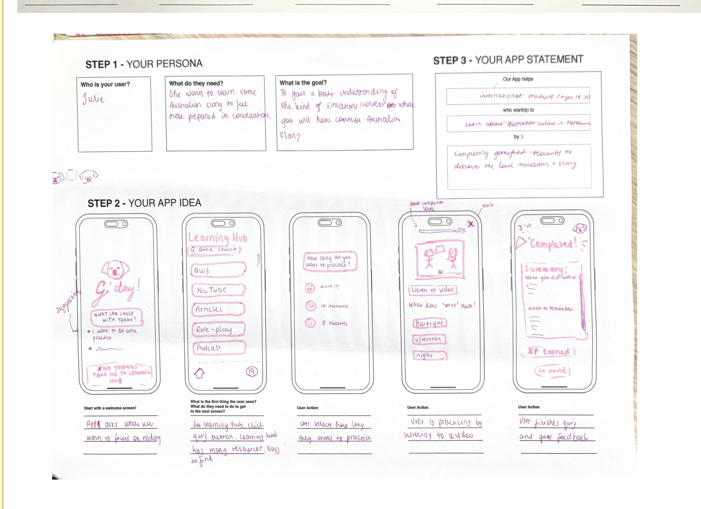
Original Wireframes
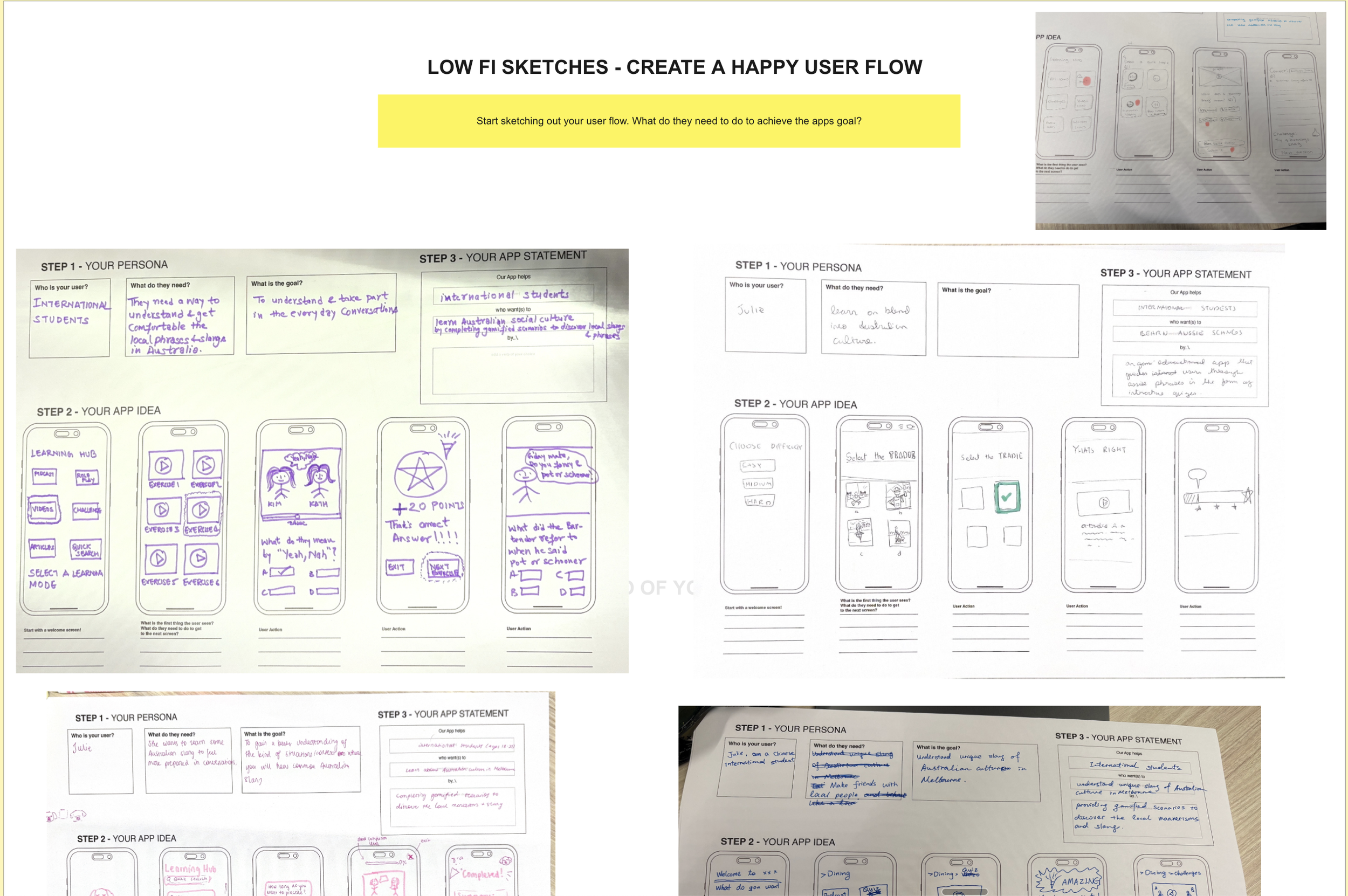
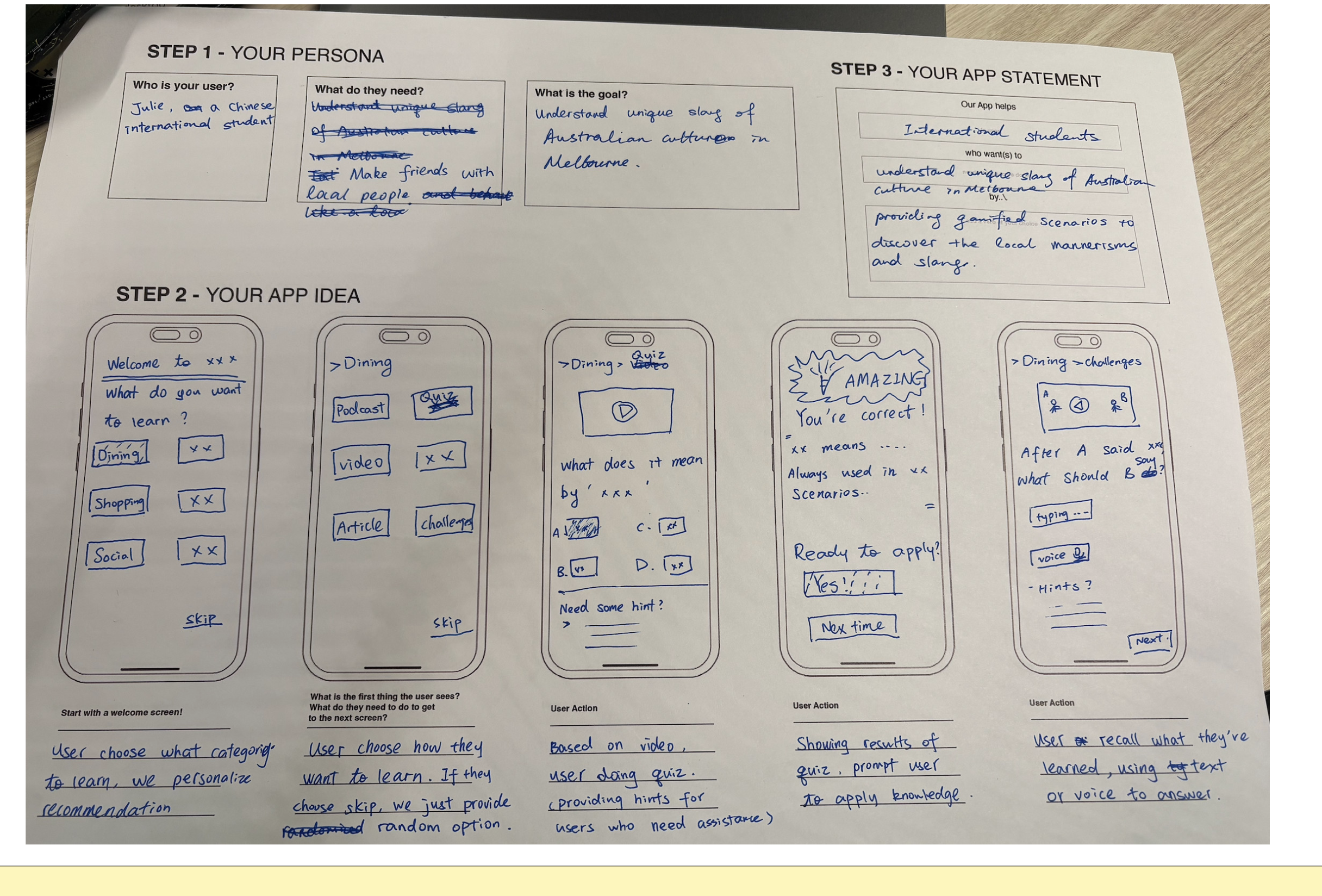
This wireframe was our initial idea after multiple iterations. We loved the idea of a ‘learning hub’ and multiple avenues users could take to learn slang. However, we started to phase out this idea for a more dictionary-focused app as slang does not necessarily need to be re-educated to the extent that we initially thought. Therefore, we phased out the over-gamification of the app for a more educational tone so users are able to quickly and effectively learn slang. This also allowed us to persue multiple examples within one page as opposed to the gamified trivia format.
Figma Iterating
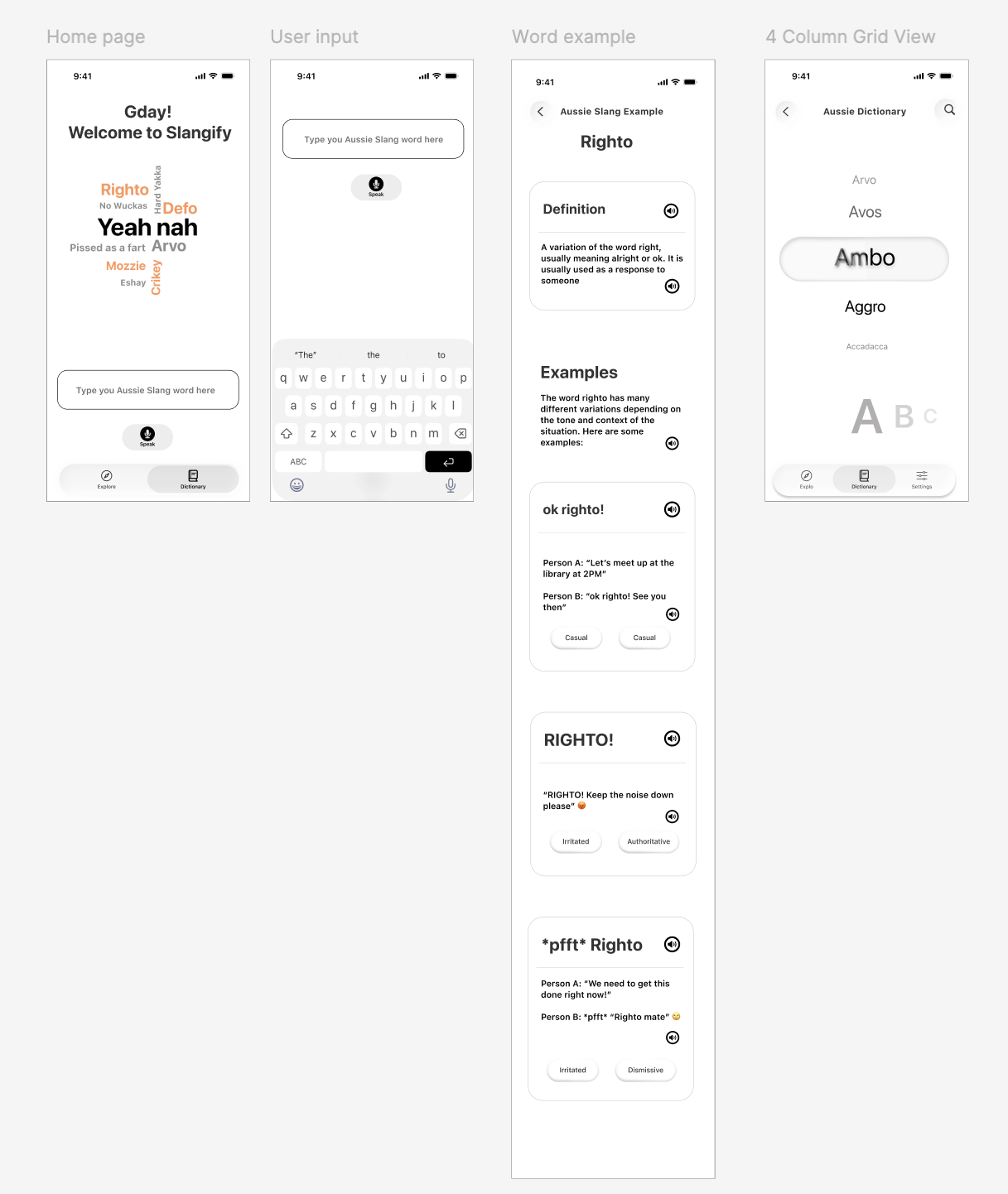
Prototype 2
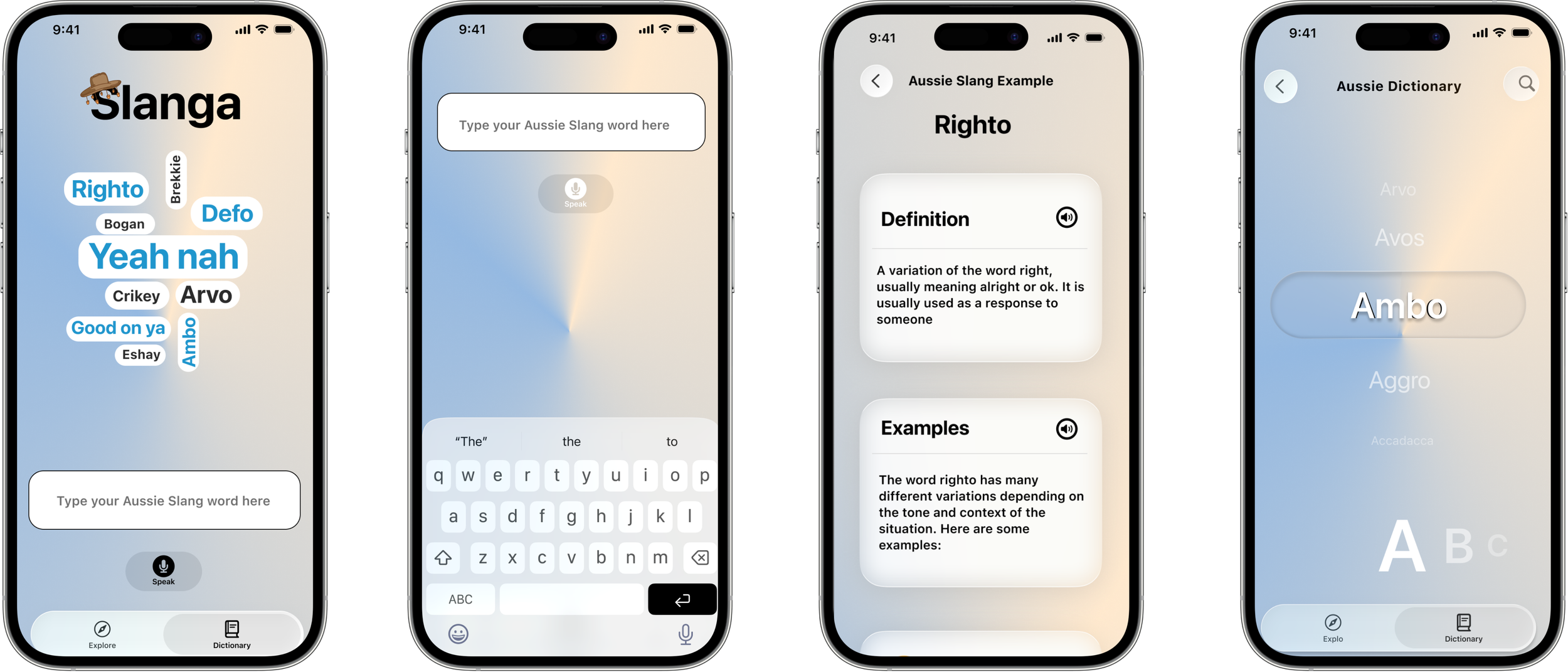
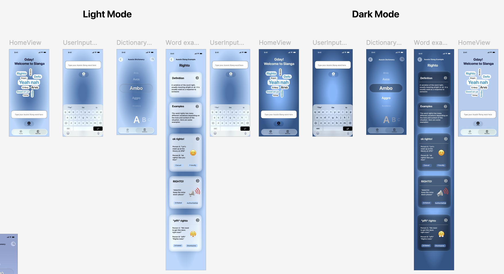
Dictionary became more interactive with a more rotary layout. This helped define what word is selected and had the alphabetical categories underneath to easily scroll for words. The search bar for the home page remained one page, however it was split into 2 to show the layout change when the keyboard is activated.
The word example became a scrolling page to showcase all variations within one page, allowing VoiceOver to be integrated into each example and better integrating the tone indicators so differentiate between the variations.
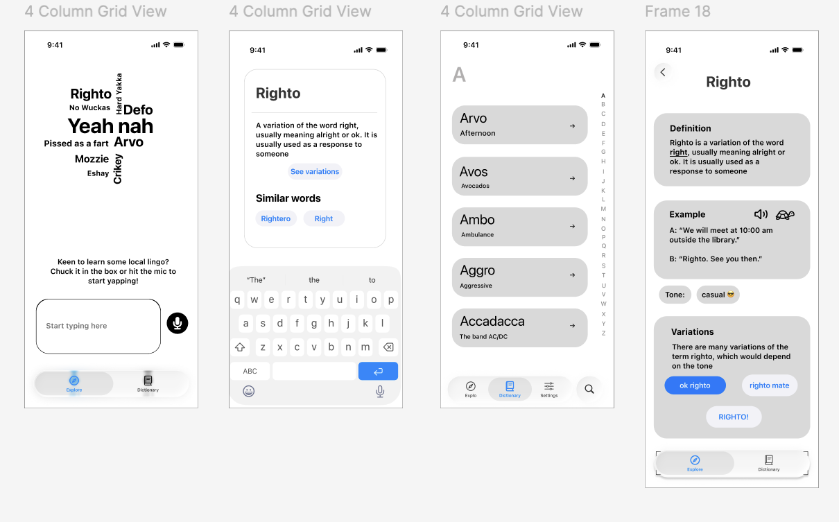
Prototype 1
Dictionary followed a layout similar to contacts with basic descriptions underneath for easy access. The variations were initially meant to be separate words, however this could be difficult for users to scroll through multiple variations of the same word to find one definition.
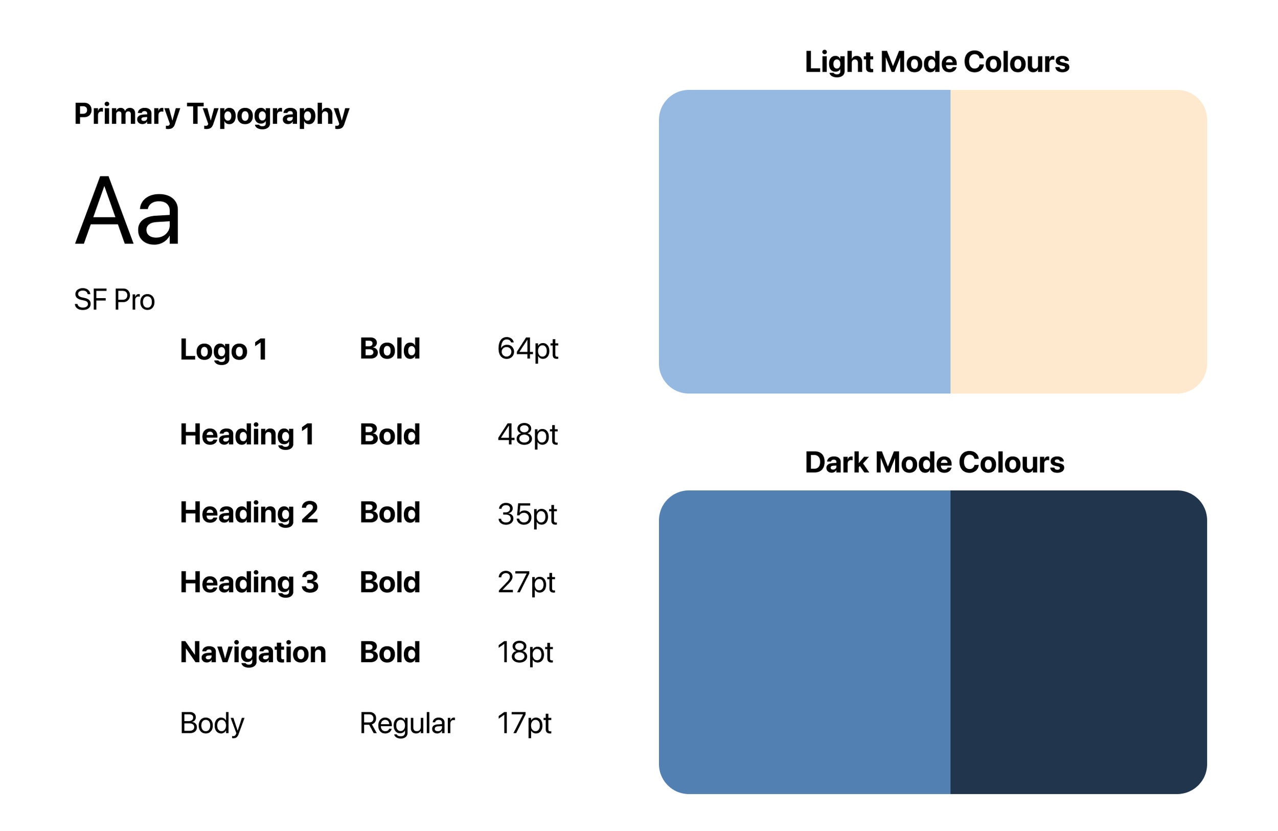
Colour Experimenting and Iterations
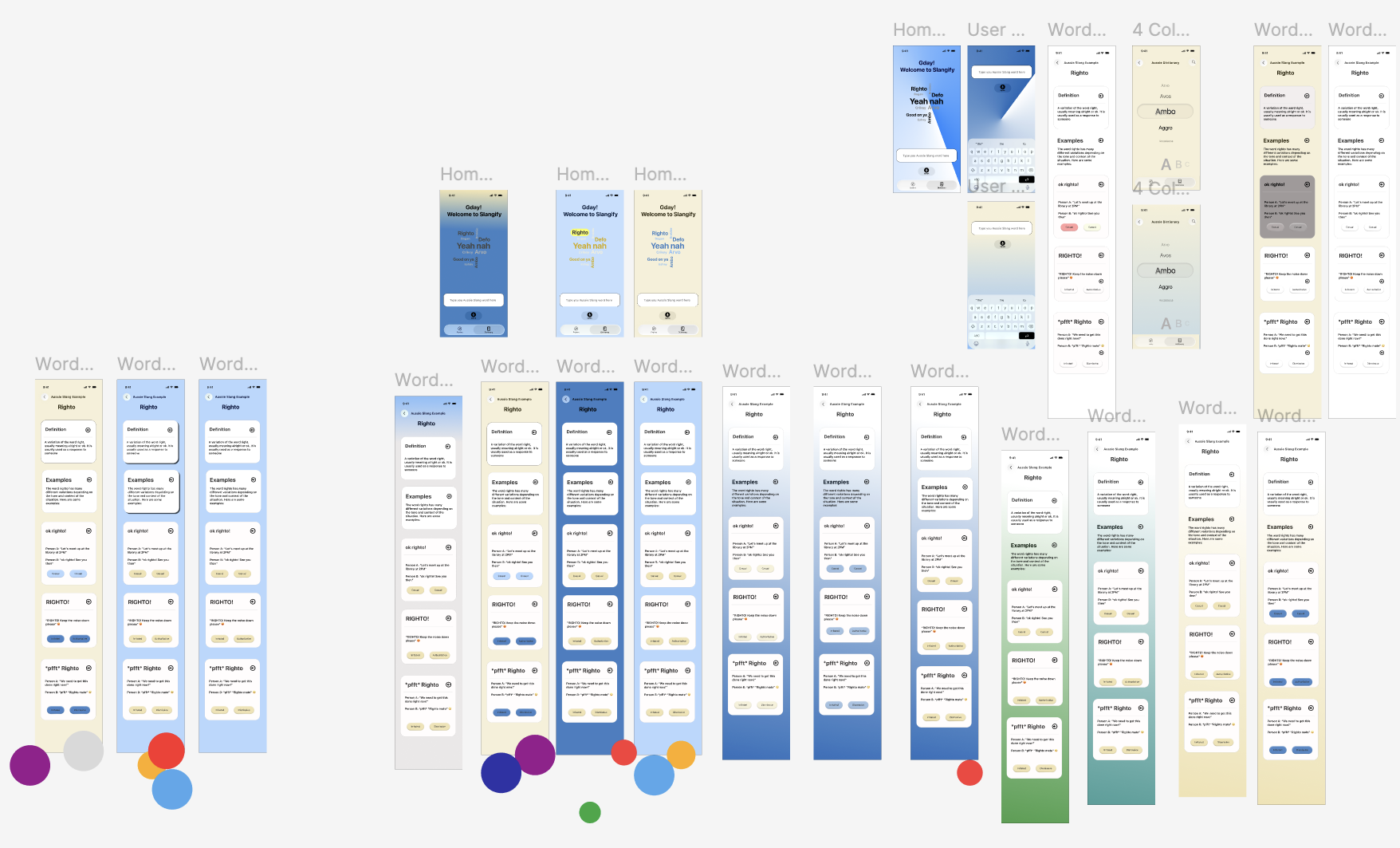
I experimented with multiple colour options, which we would then vote on to iterate further
This was a larger experimentation with Liquid Glass and how we should alter our colour palette to work with this component. While this worked effectively for dark mode, the radial gradient could be a bit jarring for certain pages and we wanted to work with a complimentary colour to add more contrast.
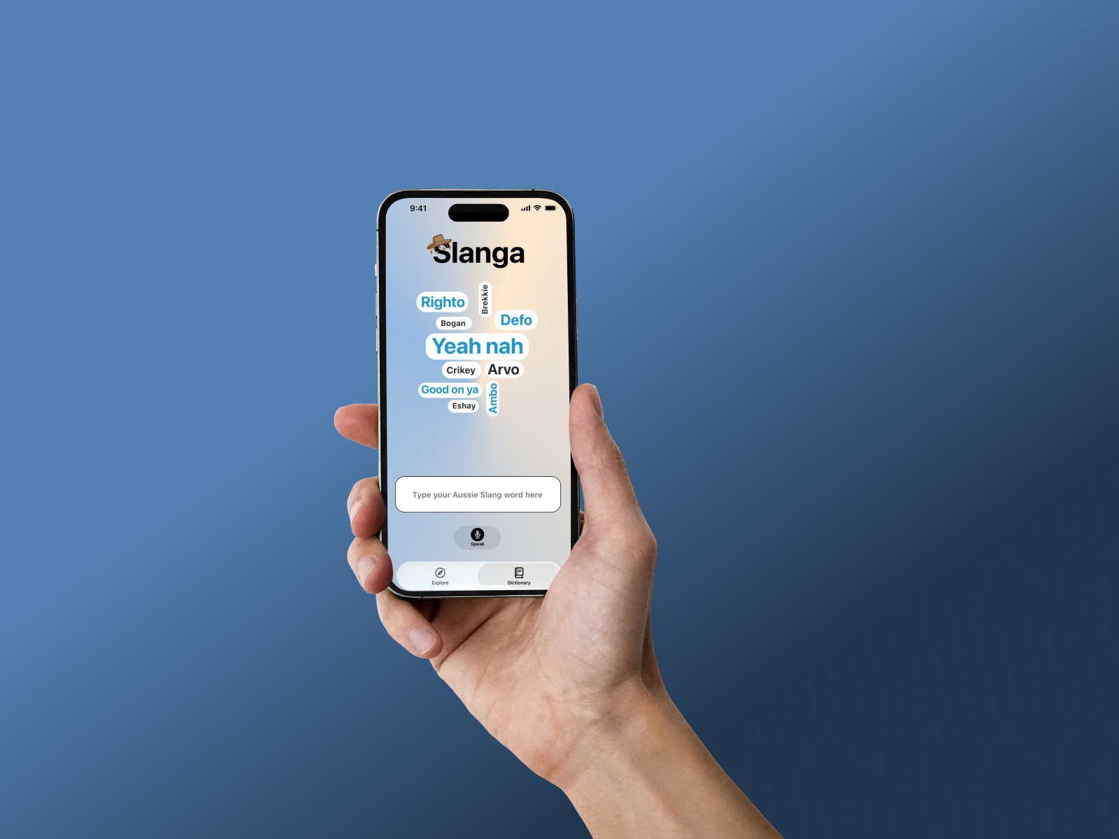
Final Visual Style

Final Product